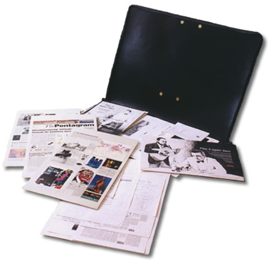
This portfolio showcases my work from 1994-2009. To see my latest work, visit: portfolio.timthompson.co.uk

This section provides a showcase for my web development and graphic design work. Galleries are separated under two headings:
This portfolio exhibits work from the start of my career to present day. 'Web Development' is distinguished from 'Earlier Work', as it is web development that has largely characterised my career, and frenzy of passion, to date. I actually started in life by studying a BTEC National Diploma in Graphic Design, and it is work from this period that predominantly forms the contents of my earlier work.
After completing my BTEC in 1996, I became disenchanted by the seemingly vacuous and shallow world of graphic design, and pursued a degree in Theology. However, with no higher calling to ministry (to date!), the degree wasn't going to be the answer to my career aspirations. Instead, it was during my final year at University (1999 - 2000) that I discovered with some curiosity the ability to purchase a domain name and create a website. It was from these humble beginnings that my enchantment with the world of web design began.
Web design is more to me than just a fad, or something clever and trendy to play around with. As a student who had to use the web on a regular basis, I was appalled by the plethora of poorly designed sites that littered the internet in the late 90's. Websites by my judgement fell into two categories:
If the web was just another limited type of media like a magazine, perhaps these failings wouldn't matter. But it is because the web clearly had so much more potential, it couldn't be ignored. The world of design was no longer vacuous and shallow, it was a world that needed good designers, with an understanding of the medium, its potential, and a passion to put things right. It was with this vision that I stepped back into the world of design.
On producing my first website designs, I felt consummately proud of their look, feel and usability. For the first time in my life, I felt like I had 'given something back' to society. However, my manager at that time began asking me how visually impaired users would access the site, particularly given my use of graphics. I was short of a good answer. In 2001, accessibility wasn't a big issue, at least in the UK, but it began to gnaw at my conscience. I had billed myself as someone who could build enjoyable, usable websites, but this wasn't everyone's experience. In addition, the power for the web to be accessible is one of its greatest strengths, and I began to feel like my websites were as wretched as the one's I had criticised in the late 90's.
So, in 2002, I took it on myself to re-learn HTML from scratch and do a better job. Accessibility became a central theme of my MSc studies, and from Summer 2003, I was beginning to develop work that gave proper consideration to good coding, structure, and accessibility.
With the web constantly evolving, it's hard to know where best to direct my energies next. As aforementioned, my priorities have lain in getting the cornerstones of usability and content delivery right. In turn, I have built on these in the areas of accessibility and developing a better understanding of the media and its technology.
On the creative side, I am currently developing my skills in area of rich media and the use of Flash. Learning technologies such as Flash has not been high on my agenda in the past, because of its proprietary nature, and my desire to excel in getting the building block technologies right first. Additionally, there are developers who devote their whole careers to Flash, and I do not aim to pitch myself at that level. However, I continually love to see how Flash has been implemented in creative and effective ways on many websites, and am working on delivering some of these goodies myself.
Primarily though, my number one 'auditing criteria' I think will always be to ensure that what I do ultimately contributes to a usable, enjoyable and information-rich web, accessible to all.